Asobo! - Children's Activity and the Communities app

UIUX Case Study - Responsive Web App Design

About this app

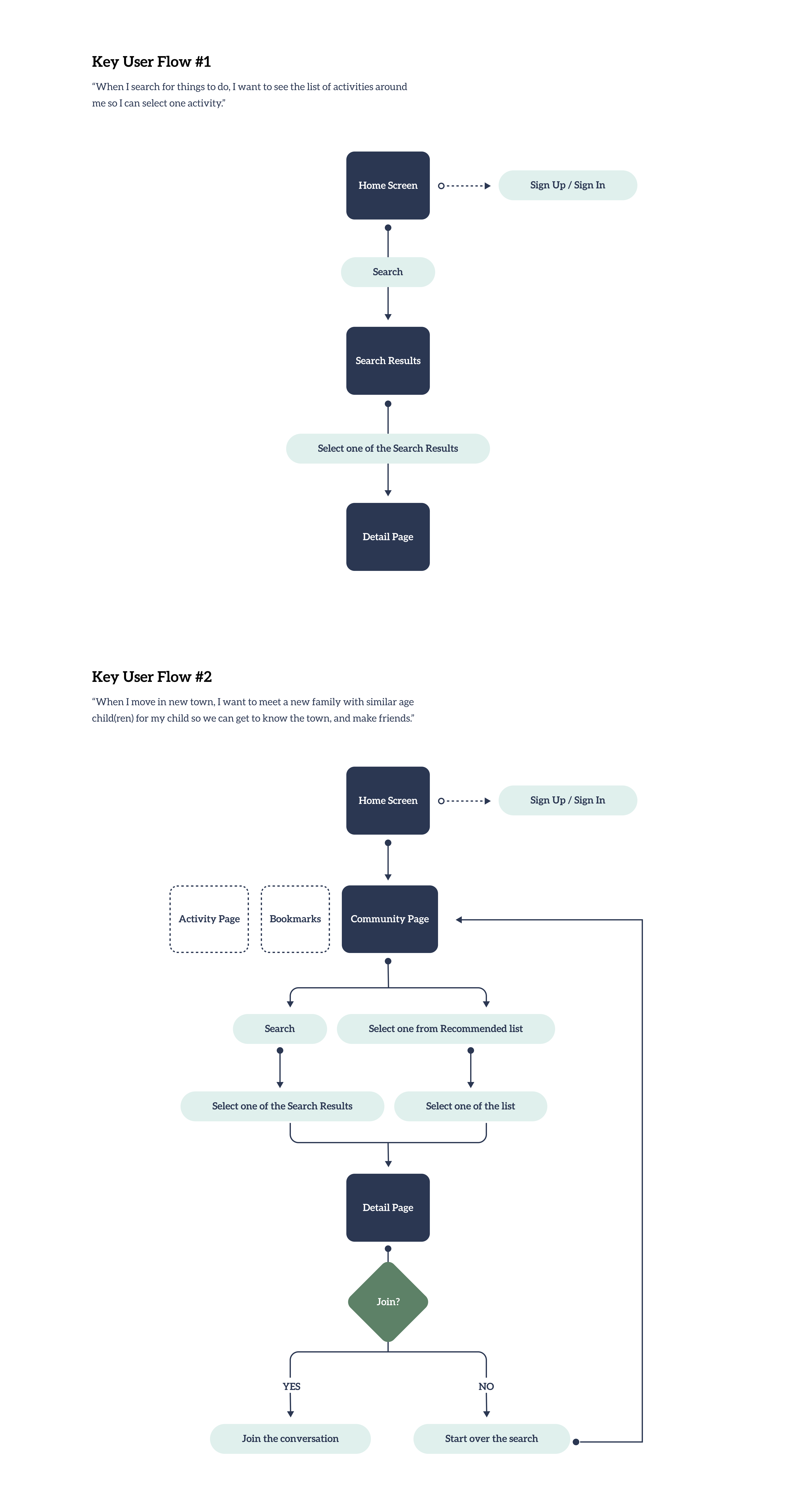
Asobo! is a responsive web app for parents and guardians looking for children’s activities and new friends.

Asobo! means “Let’s play!” in Japanese. The symbol above “Asobo!” is a Japanese  Samurai helmet called “Kabuto.” Young kids, especially boys, make origami helmets to represent health, strength, and power. So I added “Kabuto” in the logo to wish every kid a fun friendship with their new playmates.

Problem

As a parent trying to look for things to do for your kid, one may use Google Search, Yelp, and perhaps a travel app but none of them cut it. Every parent I have talked with were hopping on different websites just to get one result. There is no centralized place to find things to do for their kids.

  • Too many websites to search with just to get one result.
  • Not many websites recommend kid’s activities near you.
  • A lot of parents are looking for local activities and unique experiences. (not many families can go to Disneyland every weekend!)

Solution

After I learned we shared the same concerns, I felt the mission to create the Asobo! app.

My solutions are:

  • To focus on and provide information about the local activities and communities.
  • To create communities where everyone can participate in a friendly atmosphere.
  • Families new to the neighborhood are welcome. Those new to hobbies are welcome. The main goal in the communities is inclusiveness.

Design Process

User Research

After I set the target users, I sought user interviewers based on the target users' categories. Then, I conducted interviews to get to know their pain points and other opinions when they seek information about their child's activities.

Key User Flow 1, 2

There are two key user flows within this app. 1 - to search the activity the user is looking for. 2 - to find a community that the user’s child can enjoy and make more friends.

Lofi & Midfi Wireframes

Key User Flow 1

After the main user flows are set, I moved on to designing Lofi Wireframes.

Key User Flow 2

UI Process - Mood Board

After Lofi and Midfy wireframes were set, finally, I started working on the UI side of the process.

Creating a mood board gives great support to have the vision and the feel. It guides the direction of the app. I wanted to have a warm tone in the app to welcome those new to that community.

UI Process - Preference Test

Before I designed it too far, I wanted to conduct a preference test to see which type of feel the users resonate “kids activity” app.

If you would like to see the test content and the feedback, please click the button below.

UI Process - Style Guide

I created a full set of Style Guide that gives cohesive elements.

Hifi Wireframes v1

After finding out what resonates with the users the most and created the Style Guide, I started to design the responsive part.

Feedback

I conducted another user testing on one of the hifi wireframes. I chose this specific frame because of the structure's complexity. It has more information on the page, and I wanted to get feedback on the balance of information hierarchy and image, among others.

Positive

“You did a really good job when thinking about the hierarchy and what information the user would like to see/in which order. You also used color really well, the colors complimented each other and also helped identify important information quickly and easily.”

“I love your logo, and the font that you used in creating it, it is easy to read and fun to look at!”

“I like your choice of colors for your color palette, I feel that they combine together really well.”

“Everything is clear on the screen. There is no doubt about what we should do.”

“The font style and the color palette bring a feeling of softness, safety that feel the theme.”

“Incredible job on the L screen, it looks super professional and well put-together”

Constructive

“You did a really good job when thinking about the hierarchy and what information the user would like to see/in which order. You also used color really well, the colors complimented each other and also helped identify important information quickly and easily.”

“One thing I would check are little consistencies here and there like the size of your search icon on each of the screens. It seems to be getting thinner as the screen size gets larger. ”

“The colors for “Store” and “Medical” feel a little too similar and I would make the “Store” color a shade of blue, perhaps a navy. ”

“Not necessarily wrong, but I would add more spacing between each section. This will make it easier for the user to scan the information. So add more space before "Business Info", "Business Hours", "Reviews", etc. ”

Improvements

After I collected the feedback, I adjusted my design based on feedback. The followings below are some of the examples that I made adjustments to.

I recieved feedback about the spacing from a few people. I increased the space and it looks much better and doesn’t look clutter anymore.

Considering accessibility, I changed the shapes of the Business Info symbols from circles to different shapes since it was brought up that the colors were too close to each other.

I changed the background color of CTA to differentiate it from input text field elements.  I made the primary and secondary colors set apart as well (the primary button color is redish-orange which is used in Submit button in this page).

The map looked very small and made the users feel claustrophobic before. I made it a little taller so they can see more areas in the map.

I decreased the opacity to 70% to make it obvious as a placeholder text.

Hifi Wireframes v2 - After Improvements

Once I made some adjustment based on feedback, I finally moved on to create more hifi wireframes.

Mockups

Challenges

Challenges

  1. I included accessibility in my design because I want everyone to use my app. Although to consider the perfect color palette that would pass the color contrast checker was a challenge. For example, my primary color (reddish-orange) against white was failing in the color contrast checker. When I adjusted to a more accessible color (darker red - almost brown) for the primary, the color wasn’t attractive anymore.  
  2. In the beginning, I was planning to create a travel app focusing on children's activities with a play-date planning idea. However, my ideas were confusing, going too many directions considering travel planning, kids’ activities, hotel, rental car, and so on.

Solutions

  1. The solution for the accessible color contrast, I took a different route rather than changing the color itself. I made the font size bigger with bold font weight.
  2. The solution for the app idea was to consolidate the ideas. My concept was too broad in the beginning so I started to focus on one element (kids’ activities) and the second element was something related to the activities - creating a community based on that specific interest. Finally, when the idea came along, things started rolling.

Takeaways

  • I learned that user interviews, user testings, and iteration are so important to creating an app that users want to use.
  • I enjoyed the user interviews to understand the users’ pain points.
  • When I conduct a preference test, I need to give fewer options to the testers.
  • Competitive Analysis is another important key to understanding what the other companies are doing.

Thank You for reading this far!