
Platform
Web App
My Role
Product Designer (UIUX)
Duration
March 2022 - present
Tools
Figma, Usability Hub, Interact, Shopify, Google Form
Overview
Introduction
Eco Quiz is a quick assessment to understand your current sustainability lifestyle. The quiz taker also can learn what needs to be done to be more sustainable.
Who is Good4Earth?
Good4Earth is a virtual community of earth-loving supporters dedicated to fight climate change through our app. They help people quickly measure their impact on the environment through a simple, fun eco-score and provide actionable and personalized recommendations to lessen their environmental impact.
Challenges for Good4Earth
Their vision was to create a fun, interactive quiz to gather insights on consumers, where they are in their sustainability journey, and what their motivations were.The biggest challenge was balancing the number of questions to derive scoring and recommendation information and keeping it fun and interactive. Besides this challenge, other challenges include who this would resonate with, what would be our tone, what would be our channels, and how long the quiz should be. That's where I came in, wearing a consumer and UX expert to bring all these aspects together.
Goal
The Goal of Achievements at Good4Earth


I need to develop the quiz contents (questionnaires and answers), design the graphical assets, and implement the quiz at the end of April 2022.
I need to make an easy-to-understand quiz.
The goal of the quiz's conversion rate (the entry point to the completion) is 70%.
We need to get to know who our actual target audiences are.
My Journey to Launch (Design Process)

Beta Launch v1
I helped Good4Earth to develop the quiz contents, conducted the User Interviews to understand the personas and the clarity of our quiz contents, and designed the graphical assets. I also helped implement the quiz on their website and validate our quiz process.
Beta Launch v2
After we launched the quiz, we started to understand our audiences. First, we analyzed the events (entry %, completion %, and the conversion rate from entry to completion). We also gathered feedback to understand the quiz takers’ perspectives better. From there, I helped revise the quiz contents and the amount of quiz, and I modified the graphical assets to follow the revision of quiz contents. I also conducted the Preference Test to see if our revised designs resonate with the audiences.
Ideation
I was given some documents of brainstorming sessions (questionnaire and personas) that had been already created before I came in. So I set up a couple of meetings with my client and got on the same page. Based on the documents, I organized the categories and created the quiz with the user flow in mind.

Quiz User Flow
We had a lot of questions to ask, and our goal was to let the quiz takers engage until the end, get the leads, and reach the results so we could gather the data. We also wanted them to have fun while taking our quiz and a smooth flow/transition to the end.

User Research
UX Researcher
User Personas
This initial set of User Personas was already created beforehand. We have three primary user personas, as shown below.
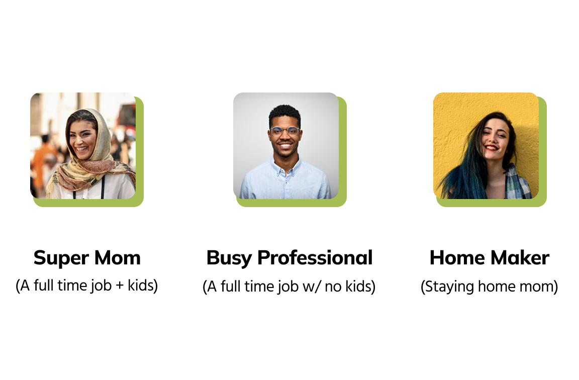
The reasons of these 3
These three categories are the ones who make decisions about what type of lifestyle they should have in the household. They establish their lifestyle beliefs and habits and create shopping styles based on that.
User Interviews
After I had built the quiz and learned the user personas, I sought user interviewers to get feedback on our quiz contents. I used Google Form to make it simplify the process. We had a total of 18 questions. The input follows after the examples.
Some examples of quiz
After I had built the quiz and learned the user personas, I sought user interviewers to get feedback on our quiz contents. I used Google Form to make it simplify the process. We had a total of 18 questions. The input follows after the examples.

Test + Iterations
Iteration - Feedback
Role: UX Researcher
Positive
“The length of quiz wasn’t too long at all”
“Most of the contents of questions and answers are clear enough”
“Most of the questions and answers are straight forward”
“It’s great to see enough options. ”
“The whole questions were cohesive, not random. ”
Constructive
“Ice Breaker questions should be first.”
“Some questions are not clear.”
“Questions and answers are needed to be precise and straight forward. Some are vague.”
“I needed a little assistance to understand what some of the question and answer meant.”
“There were a couple of questions disconnect the flow.”
Takeaways
If it takes longer than 8 min, they will be frustrated.
The takers want clear and quick understanding on questions and answer options.
Multiple options and checkboxes are very helpful to get them go through fast.
Some takers stop and think at every single word.
When you create questions, you need to think the every possible angles to avoid the confusion.
To place examples on each answers is very helpful.
Iteration - Improvements
Role: UX Designer
Improvements
We made some adjustments based on our feedback to make it more transparent and friendlier.
Some examples of improvements


Survey
After the improvements, I sent out another survey to the same interviewers to take the revised quiz and asked for their opinion. Here are what they say:
“I think many questions & options got clearer. ”
“The survey looks great!”
“Questions are more clear now. Survey felt shorter.”
“This time was smoother in terms of how the questions were arranged.”
“Love the tone, and easier to understand than last time. Didn't need to take too long to answer as well.”
“It didn't take too long to answer the questions.”
More Revisions
We received more great positive feedback than the initial quiz. However, we still have more improvements to make. Never stop to make it better! 😄
Takeaways
“Have you been xxxxing?” style of asking leads confusion about the time frame.Present? Past?
When the question is vague, they try toget hints from answers for better understanding.
You want to be polite and friendly through questions, but people usually appreciate straightforward wordings.
Quiz Platform Research
Role: UX Researcher
Before I moved on to design, we needed to search for a good Quiz platform that fits our needs. Click the button to see my findings. 👇🏼
UI Elements
Mood Board
Role: UI Designer

I didn’t have to create the website or the quiz platform from scratch. However, I wanted to clearly understand what kind of feel the quiz takers should have while they take the quiz. I also wanted to research what type of forms the other designers are using as a graphical solution for sustainability.
Takeaways
When I researched for eco-friendly-related images, I found a LOT of illustrations. The findings gave me feelings of warmth, organic, and humanization. They inspired and gave me a direction on how I should design for Good4Earth.
Graphical Assets (Questionnaires)
Role: UI Designer
Finally, I moved on to the design of the graphical asset. Since the Interact platform accepts the images for questions and answers, I precisely wanted to design for hero image and the questions so it will assist in a clear understanding of what Good4Earth intends to ask. I also carefully selected photographic assets for answers for more clarification on answers.
Some of the examples are below:


Takeaways
I am not an eco-friendly advocate. I had no idea specific questions about what they meant towards sustainability at the beginning. However, I researched why those questions are so crucial to sustainability. And I learned a lot from the research and, of course, from Good4Earth. It was essential to understand the meaning of the questions, why they wanted to ask them, etc. Soby understanding its importance, the way of asking the questions changed (e.g., Flight questions).
Graphical Assets (Results)
Role: UI Designer
When the quiz takers are done, they receive a result (they must enter their email address first).
This is the sample of the result page. The taker gets the score with the stage where they are currently. The graphic asset tells them how far you have to become Eco-Advocate (top-level). There are three stages: Eco-Curious, Eco-Active, and Eco-Advocate. They also receive some recommendations to change their lifestyle to become more earth-friendly.

More examples of Result assets

Takeaways
Within Good4Earth, we all agreed not to make the result page too long. We want the quiz taker to learn something important through our results with our helpful tips. I was thrilled that I helped them to make this quick and meaningful.
Other Stages before Launch
Front End Developer
QA
Development, Validation and Launch Day!
To help my client to succeed in the launch, I wore many hats for this project. Front End Development and QA were a part of this project. Please check out the detail page if you are interested.
Results + More Iterations
Results from v1
For our launch, we promoted our quiz to many people through social media accounts and word of mouth. Then, two weeks later, we looked at the initial data and analyzed what was happening regarding conversion rate—our goal was 70% from the entry point to the completion. We also looked at the other data, such as the primary personas, the dropoff point, etc.
Conversion Rate

What we learned from here: Key Findings
We analyzed the overview data and each question and answered how they answered and where they dropoff. Here are the key findings.
The half of the people who clicked the banner didn’t take the quiz.
A lot of peopole wants to change their eating habit.
The majority answered the barrier to changing their lifestyle is time.
If you have children, the primary reason to be motivated to change your lifestyle to sustainable seems to be always children.
Many takers thought they were beginners to an eco-friendly lifestyle but were actually eco-advocates as a result.
Those people who entered the quiz just for the curiosity seemed to dropff around Q4 ( observing from high dropoff rate there. But after Q4, the engagement rate on each question stayed stable.)
The half of the people who entered the quiz didn’t finish the quiz or didn’t see the result.
We found many inspiring answers in the results that can be a part of content creation.
It seems to be recycling is a part of their life now (everyone recycles something regularly.)
Takeaways
We had remarkable findings that gave us a direction to improve our quiz shortly. From this point, we plan to meet frequently to decide what and how to improve our quiz contents.
Iteration v2 - Feedback
We received a lot of feedback regarding our quiz. Many of them were very positive. Some are constructive. We always have learning moments through feedback. 😊
Positive
“I liked the UI, Super intuitive.”
“Very clear survey and I like the survey. ”
“I got higher score than I expected!”
“Loved the experience, not overwhelming.”
“Experience taking the quiz was seamless and recommendations are good.”
“The quiz was very well written, worked beautifully and was easy to follow. It was also fast and easy to complete.”
Constructive
“Quiz length was long .”
“What if these were just straightforward questions without images?”
“Questions can be more clear and straight forward”
“The quiz result - recommendations are great but switching to those products is another thing.”
“I am pretty much aware of all the recommendations given and there was no aha moment.”
“It would be nice to have more educational content around concepts like Terrapass.”
Takeaways
Everyone has different perspectives. Some think it’s a fair amount of questions, and some think it’s too long. It might be hard to find the balance. But it is worth trying. So we try, make errors, learn, and move on with improvements.
Iteration v2 - Preference Test
We reviewed the entry point of the quiz, and I suggested creating different banners to grab more attention, so it prompts more clicks to enter the quiz.
I used UsabilityHub to conduct the Preference Test. We asked the audiences to take this test through social media and other platforms and received 44 responses. The results are below.
“We are looking for an easy-to-understand yet impactful image to prompt answering our sustainability quiz. Which one do you think connects to the participants the best?”

Takeaways
We received unexpected results (we expected the trash image banner would be the #1 choice). However, we learned that we could use a particular one on a different platform for different audiences because of their reasons.
Iteration v2 - Improvements
What did we learn from the data and feedback? Here are examples of our improvements.


Other Changes
After we learned, some questions were obvious to see specific answers, so we removed, consolidated, or replaced questions to keep the number of questions low.

Takeaways
While modifying and improving our quiz, we also learned that we could inspire and make them aware of what type of lifestyle can cause and reduce carbon footprints by asking related questions.
Launch v2
The preparation for launch is still ongoing. We are planning to launch v2 in August 2022. I will keep posted the results as soon as we gather the data.
Challenges
We received many valuable feedback and suggestions. We hope to make the changes, improve the quiz, and add more valuable, informative features to the website and content to the social media. However,we still have many things to figure out how to deliver them efficiently to convey our mission to more people.
Overall Takeaways
During this journey of creating and improving the eco-friendly consciousness quiz, I was thrilled to be a part of a team with the same passion for bringing awareness to improve our planet. We brainstorm together when we need extra brain and ideas, and we get helpful information when we find something and incorporate it into our beliefs.
I like what I have experienced with Good4Earth. They genuinely care about our project, care about each other, and care about the planet.
Even though we only reached about 60% conversion rate instead of 70%, the overall UX & UI design I contributed helped the quiz takers understand the quiz content and our mission.The feedback shows that the design was very intuitive, which was the direction I was aiming for! 😄
As for the next step, I gained a lot of positive experiences and the following skills I earned from this experience to bring to the table for the next opportunity.
Communication and collaboration skills to deliver the client’s needs.
Listening skills to understand the other perspectives.
Design skill to design the elements with different angels/views in mind.
Comment from CEO - Payal Shah

“Yuko has been an absolute pleasure to work with. She is creative, innovative and an awesome team player. In a start-up, you appreciate people who have capability to expand their skill-set, wear multiple hats, understand and bring a vision to fruition. We found all of this in Yuko along with a great attitude. She is going to be an asset to an team/company she joins!”


